Knut Hansen
The Hamburg gin with the blue eyes.
Services
We are very pleased that we have been able to contribute to Knut Hansen establishing itself as one of the leading gin brands in Germany and is now the No. 1 handcrafted gin.
Came to stay.
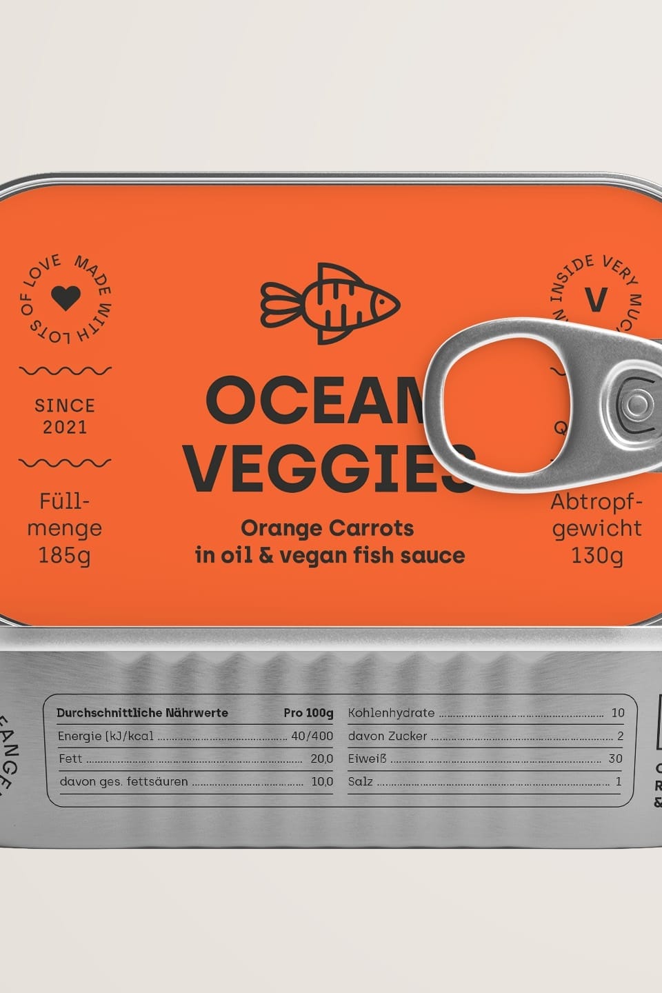
After its major revival in the 2000s, gin has once again become a cult spirit and a real lifestyle product. Which is cool, because we love gin and design. Both have been greatly boosted by this development. However, this also raises an important question for marketing: how do you stand out from the gin mainstream through design?
This question was also on the minds of Martin and Kaspar, the founders of Knut Hansen, when they commissioned us to develop a unique and unmistakable design for their Hamburg gin.
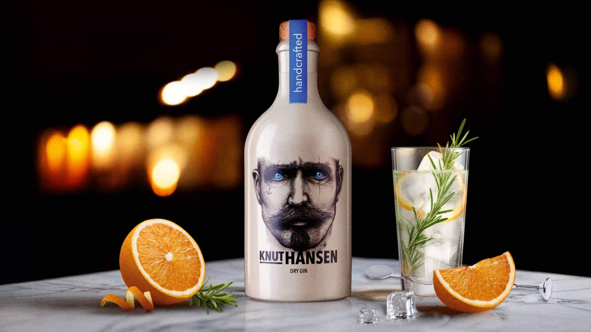
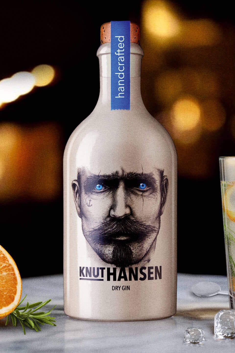
The answer was found in the start-up’s fundamental motivation. In addition to its North German name, the Hamburg gin was also to be given a nautical look that visually conveys the brand values: Pithiness, adventurousness, freedom, willpower, sustainability.
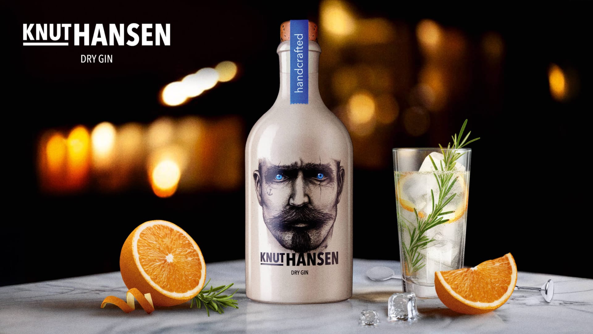
The face of the brand.
The rough sailor Knut Hansen with the bright blue eyes. The design and brand presence is of course characterized by the display-strong face with the intense look, but also by the blue signal color in combination with the otherwise monochrome, minimalist design.
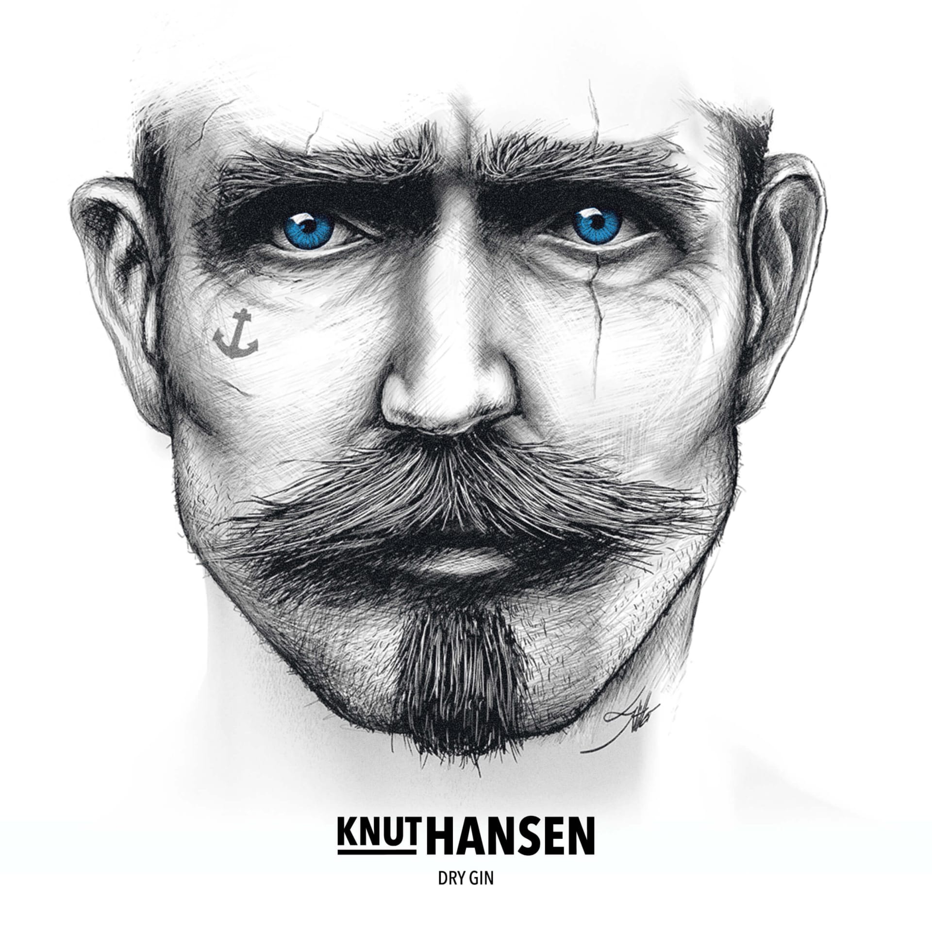
In addition to the clear, sans serif typography, an illustration style was chosen that strongly expresses the wonderfully rugged nature of the north and creates an unseen aesthetic on the shelf.
Well then, dew!