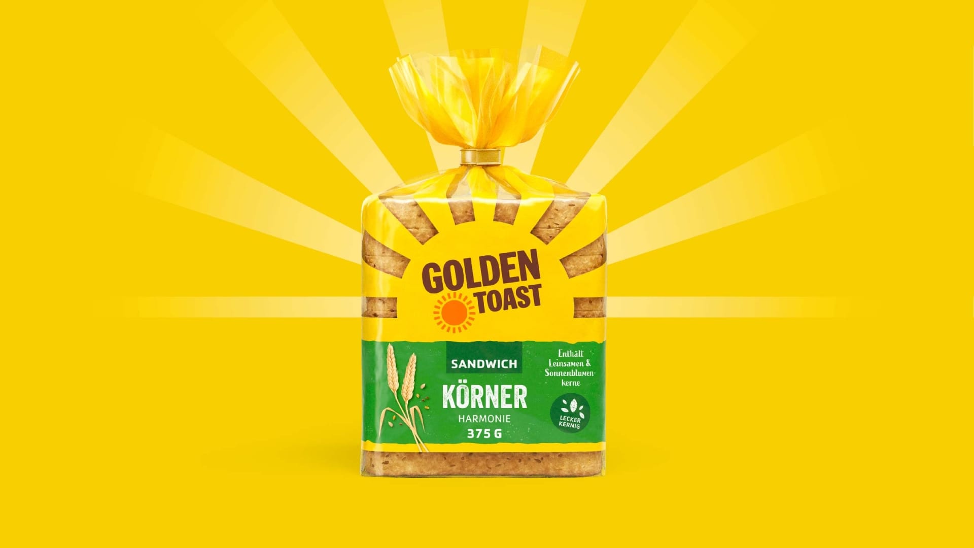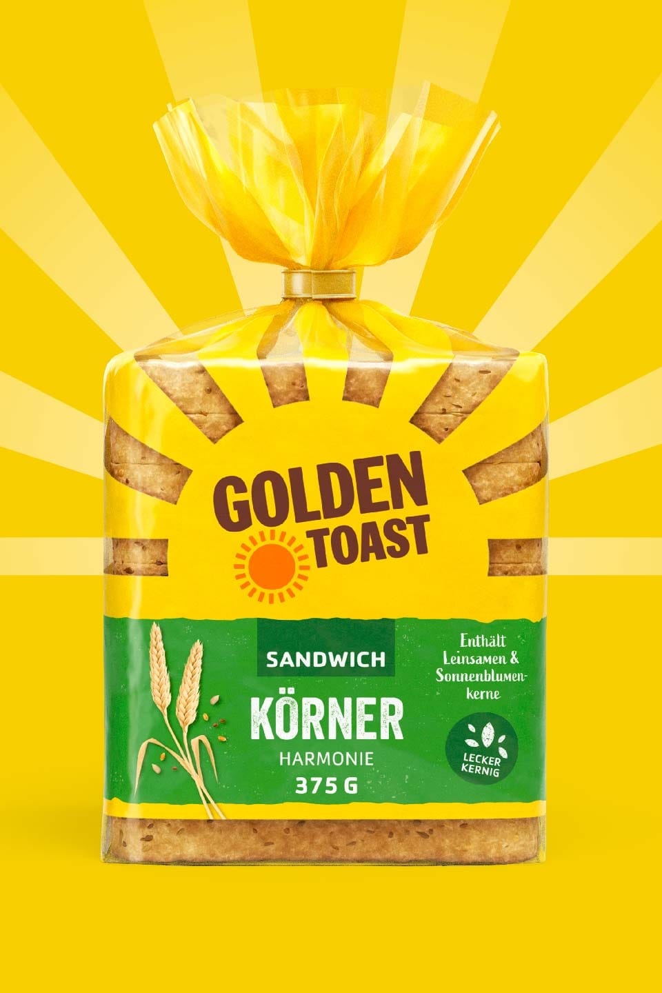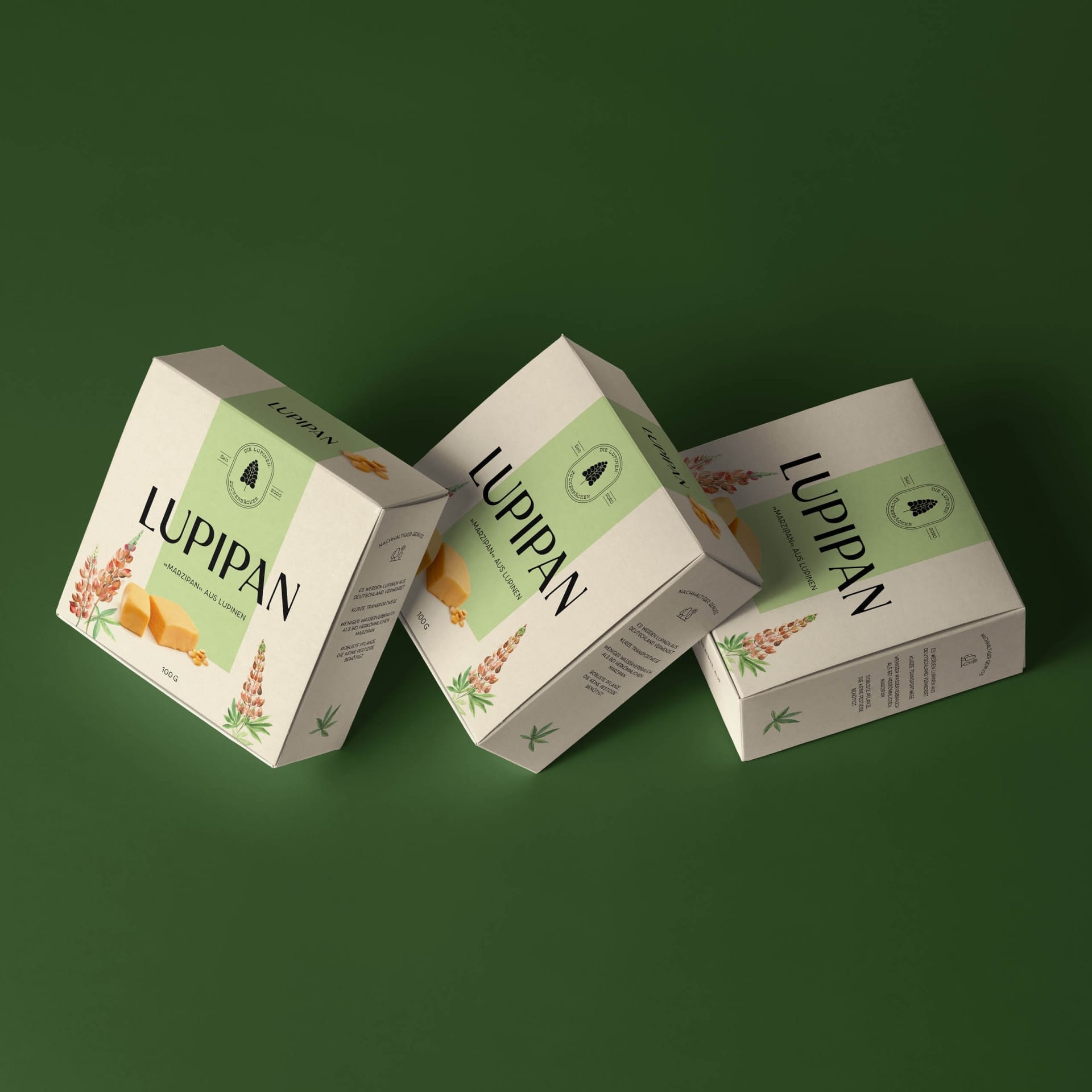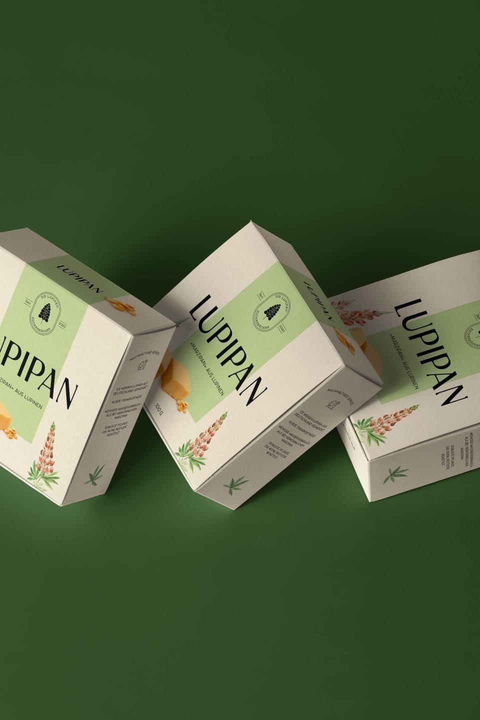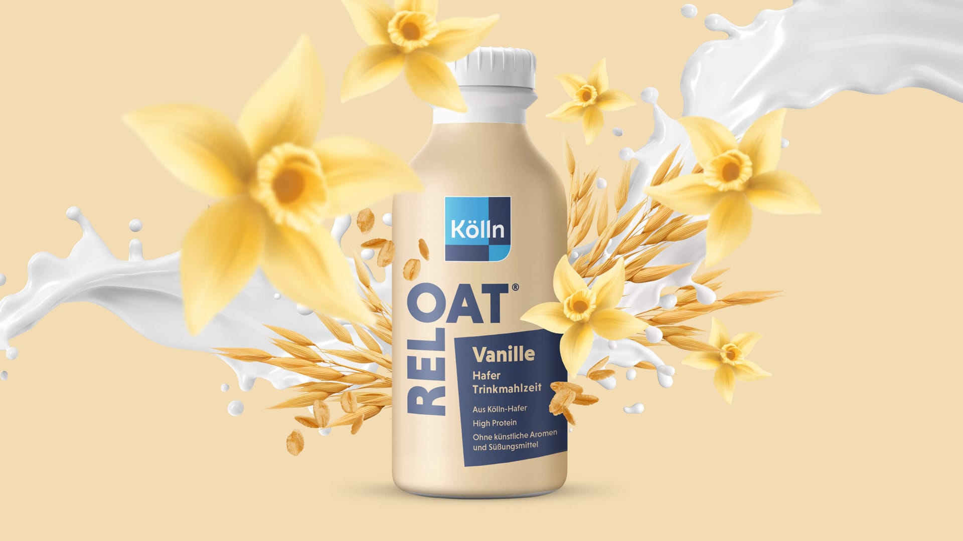
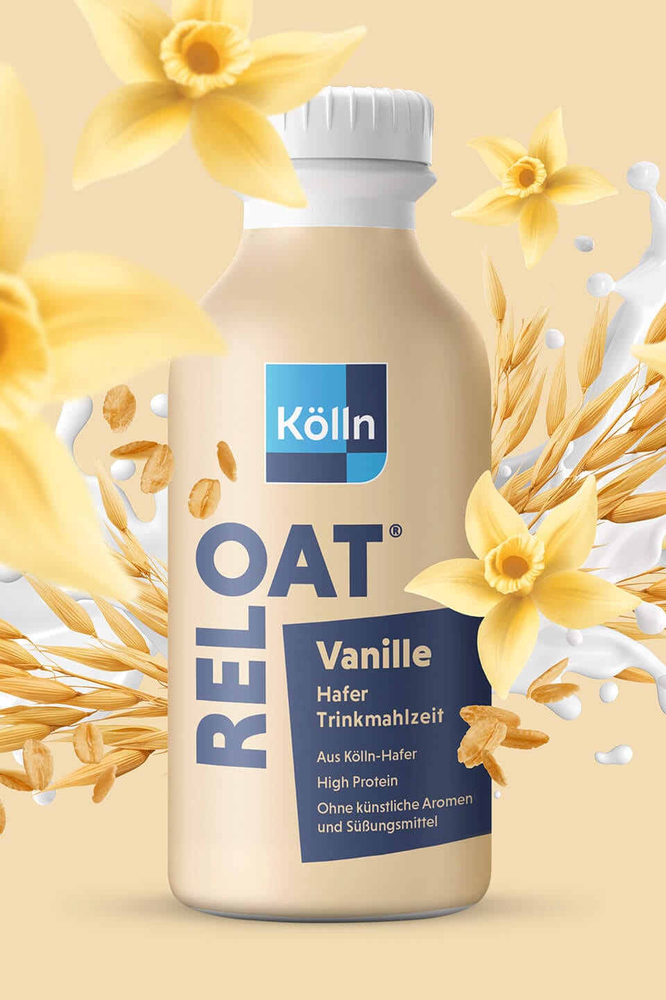
Kölln
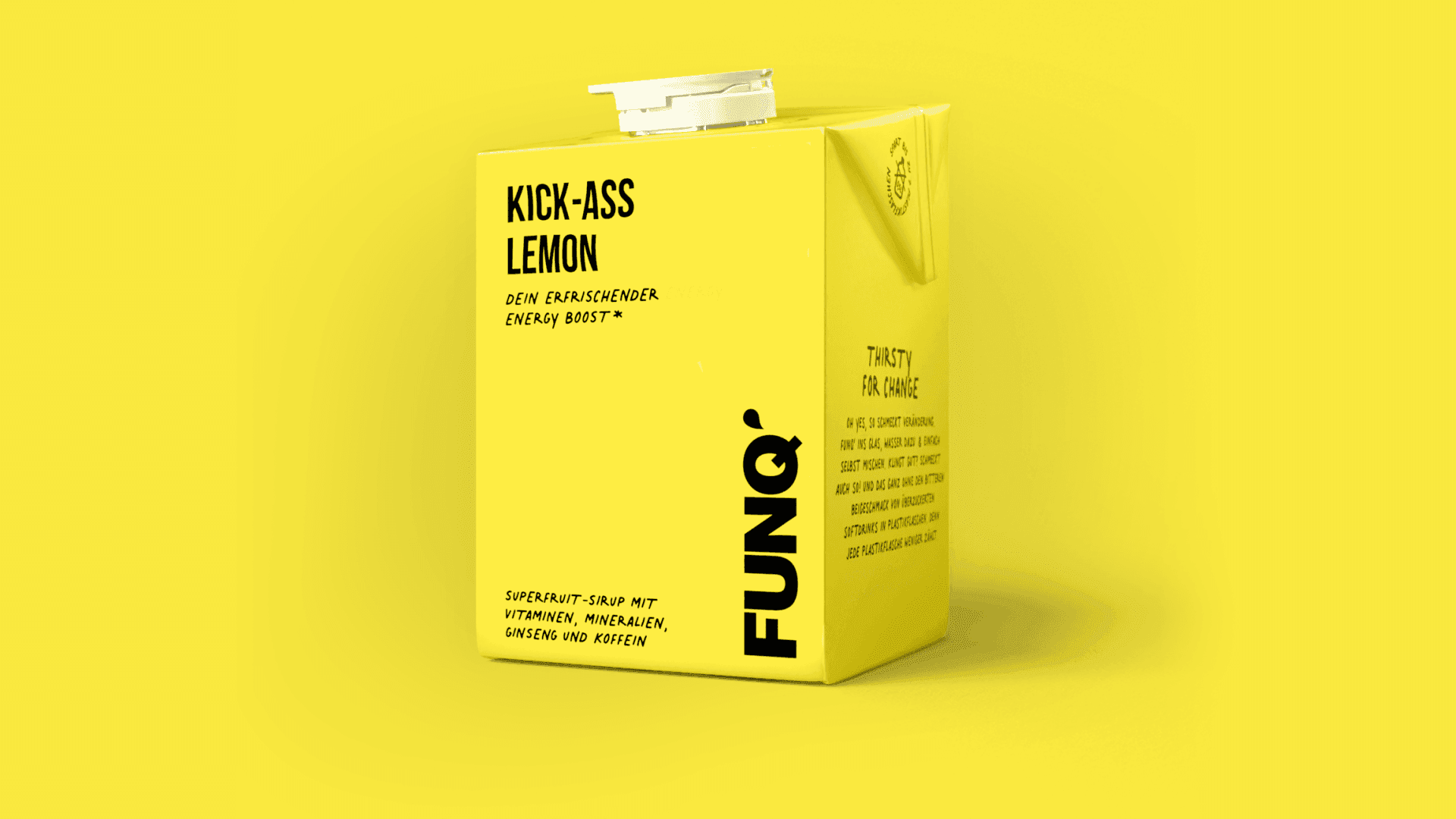
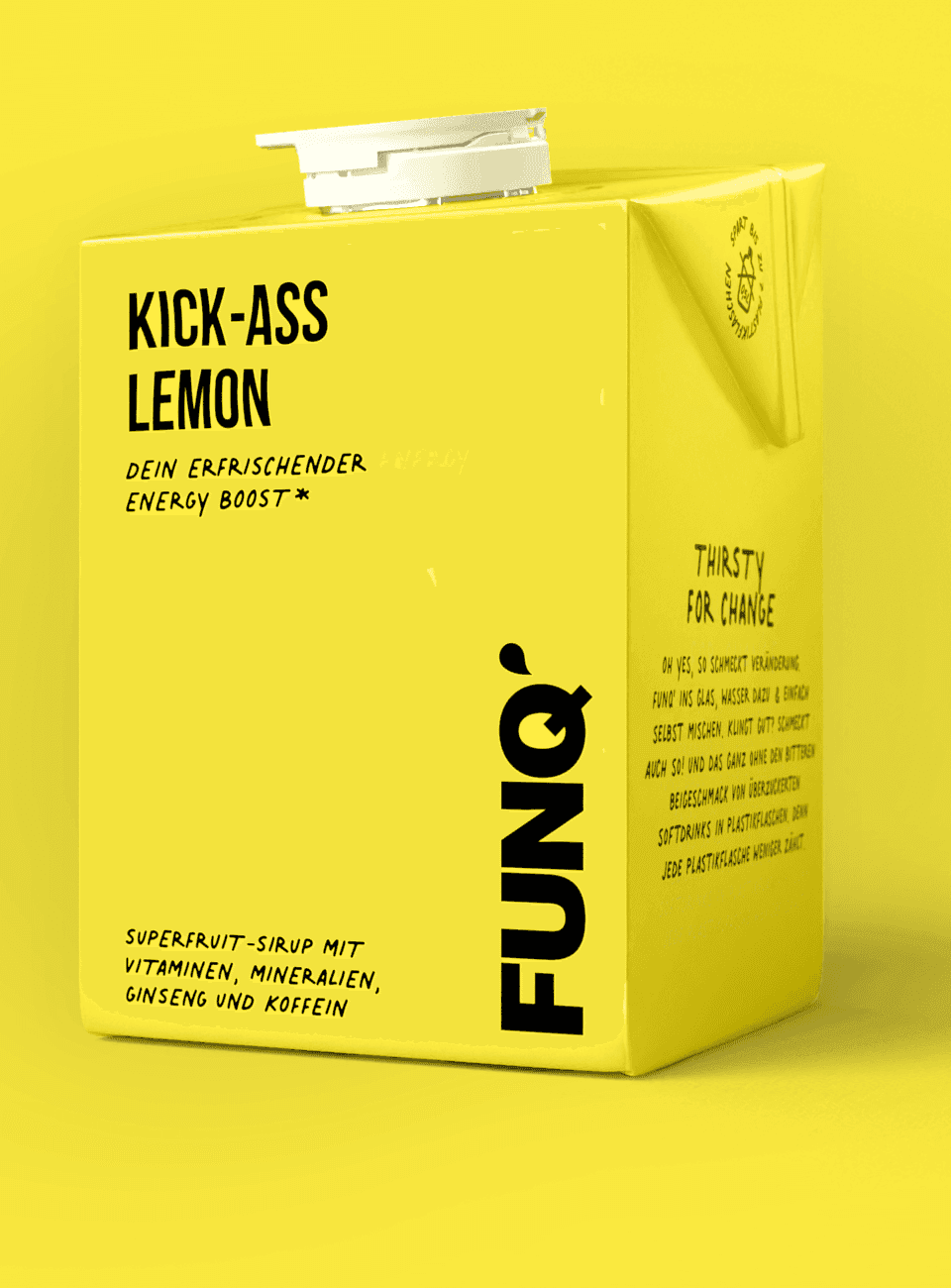
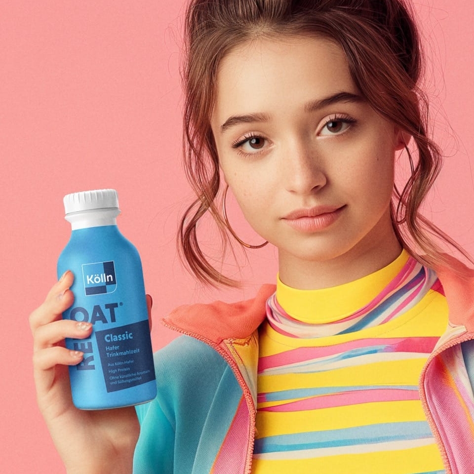
The Reloat drinking meal.
Services
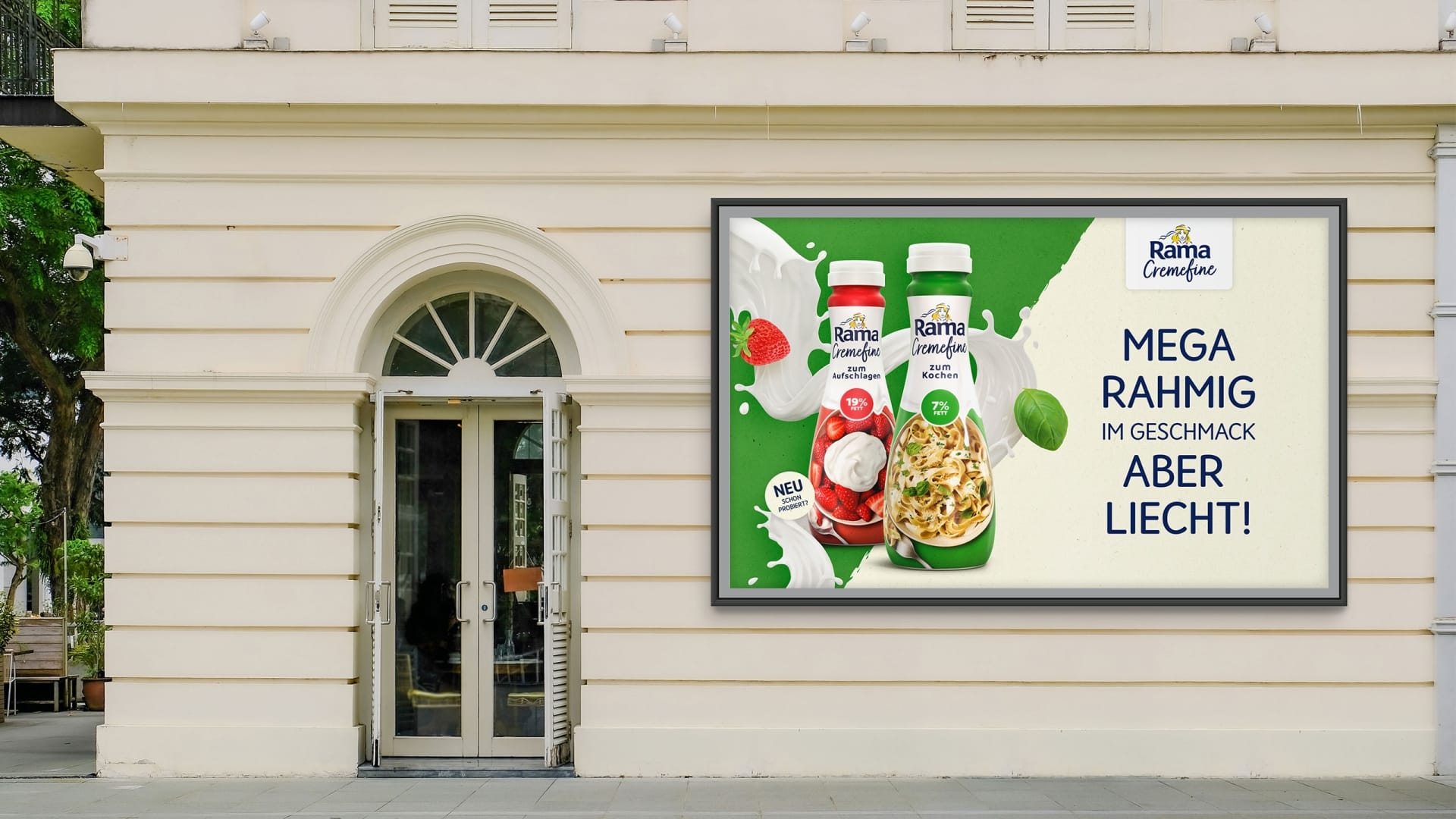
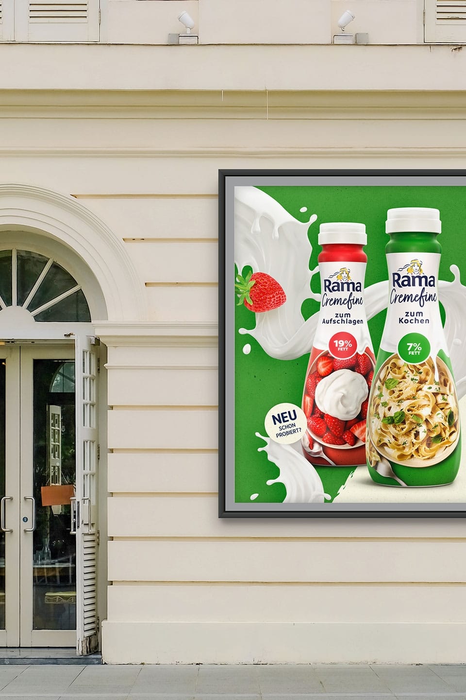
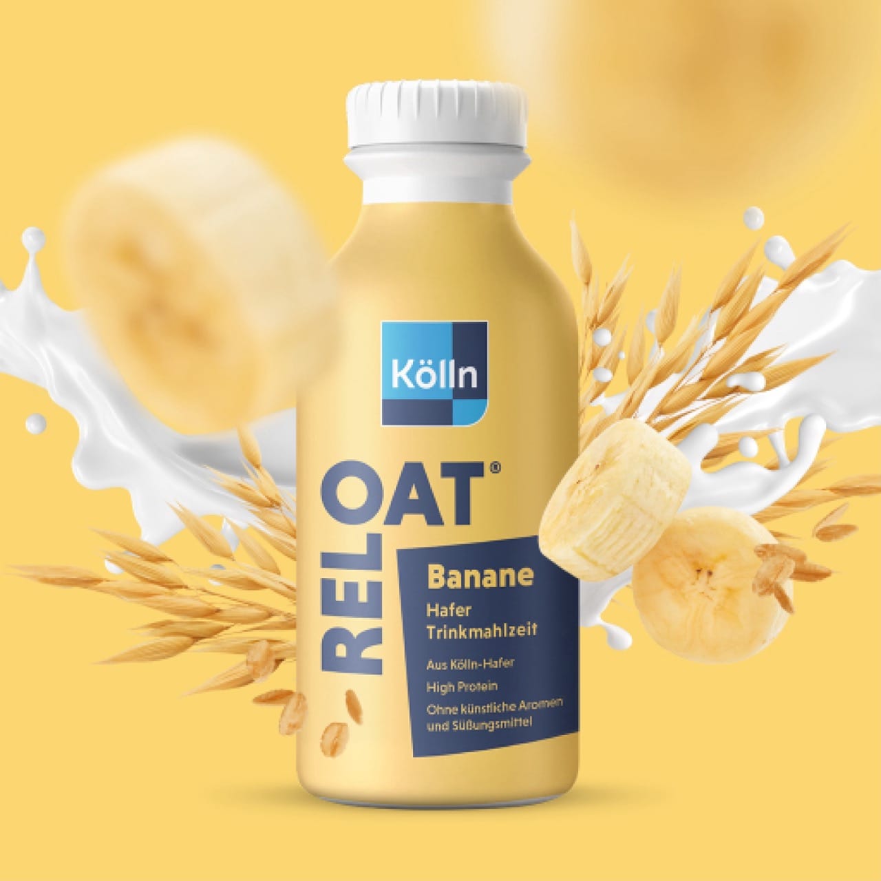
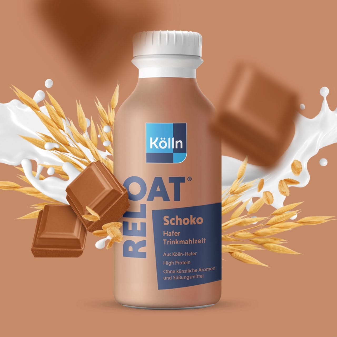
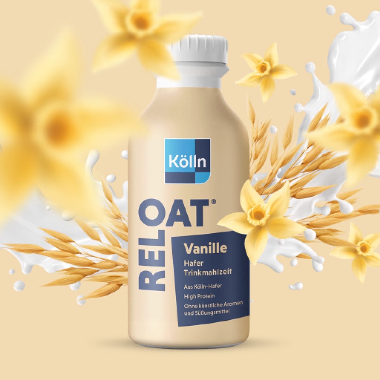
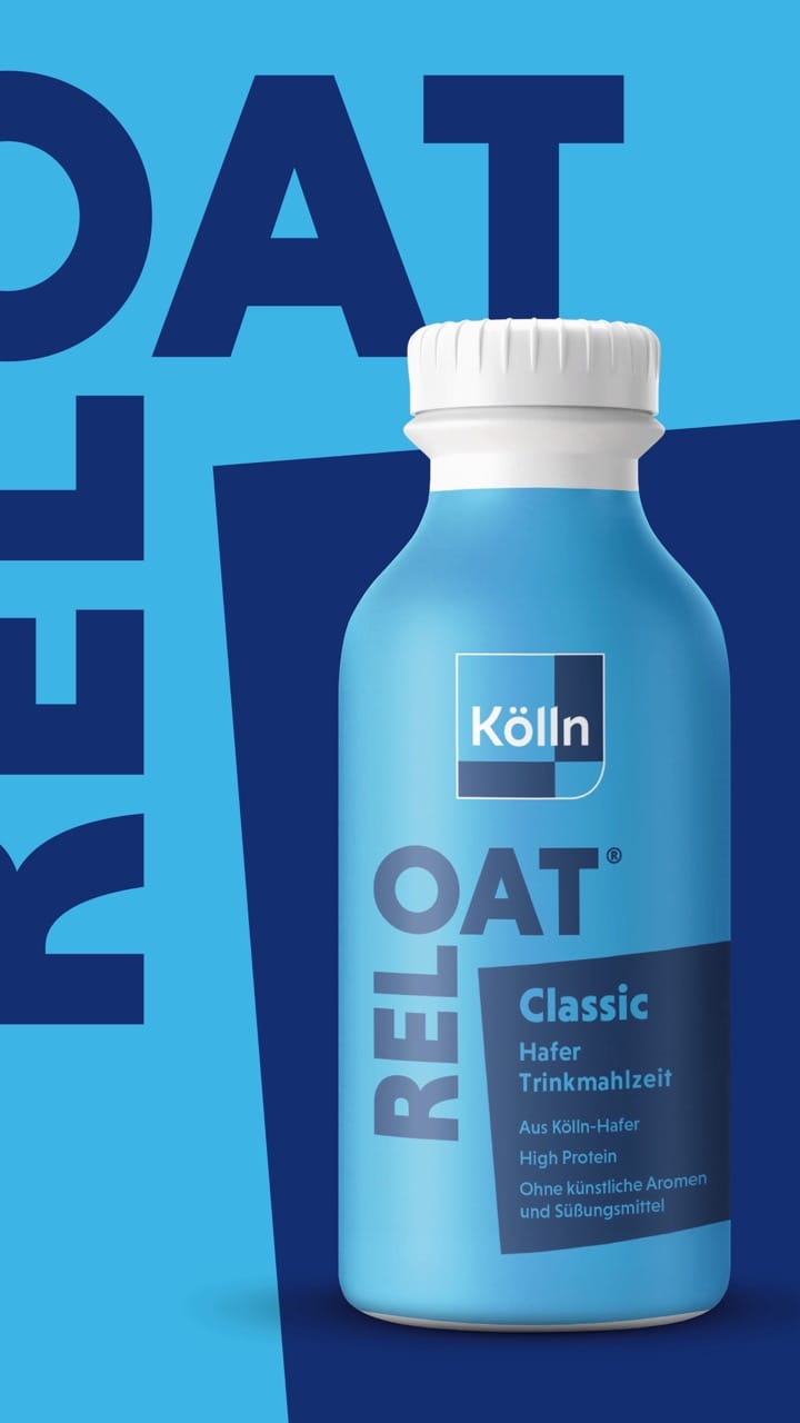
With our Kölln Trink-Mahlzeit design, we present the product for an enjoyable and conscious lifestyle in its most practical form.
Design that creates brand identity.
RELOAT stands for energy, balance and joie de vivre. And that is exactly what the design reflects: modern, lively and full of flavor.
The color palette is deliberately chosen – soft cream tones meet bold blue. This combination creates confidence, signals naturalness and at the same time gives a fresh, urban look.
Oats nice day – with the Kölln drinking meal.
The concise, sans serif typography looks confident and clear – just as the target group loves it. “RELOAT” is not just an innovative brand that thinks outside the box: the eye-catching lettering ensures brand recognition shelf impact.
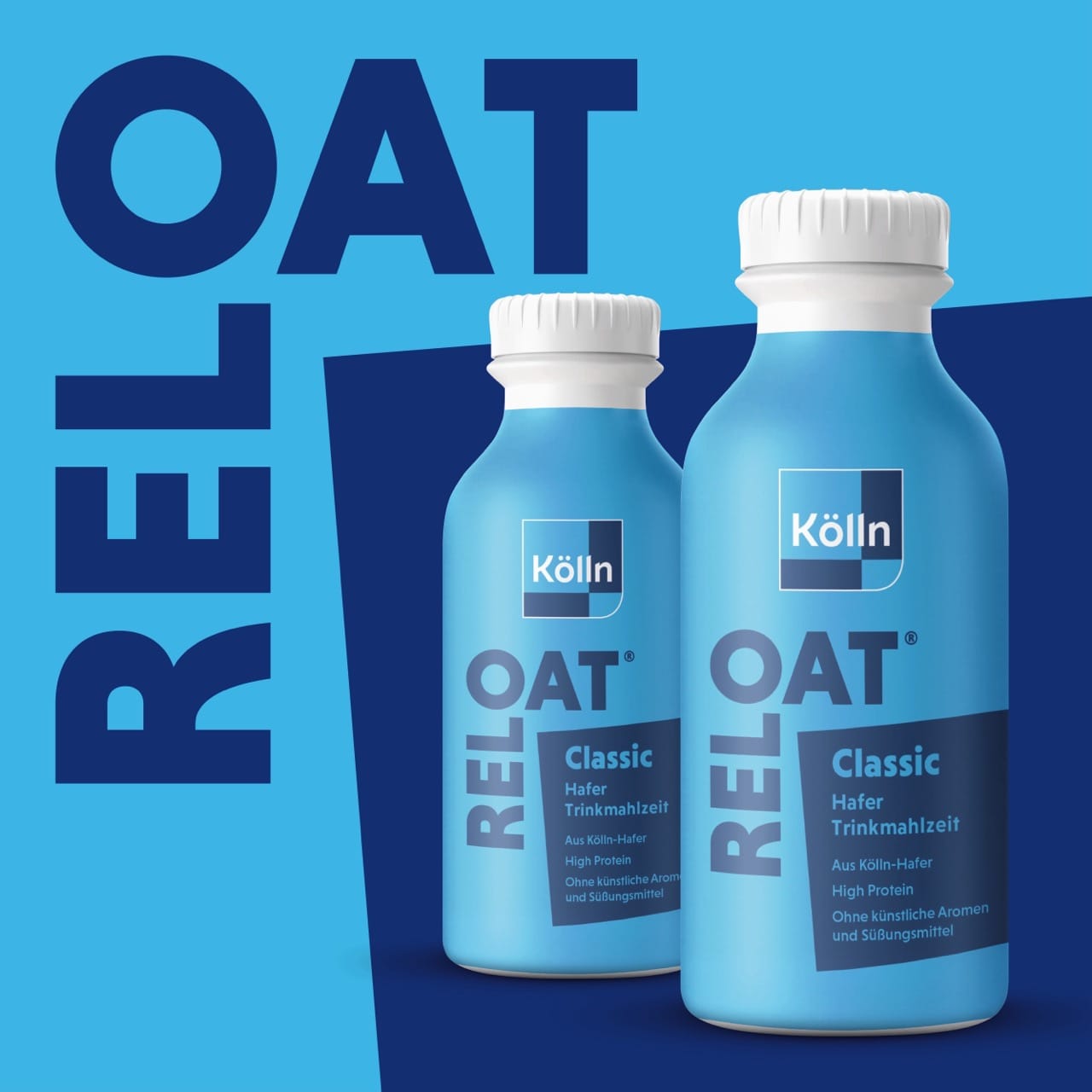
The reduced layout guides the eye in a targeted manner: Brand name, product type, flavor – everything can be grasped at first glance. The clear grid and clean type hierarchy emphasize the high-quality overall image. The result is a design that not only appeals, but also sells.