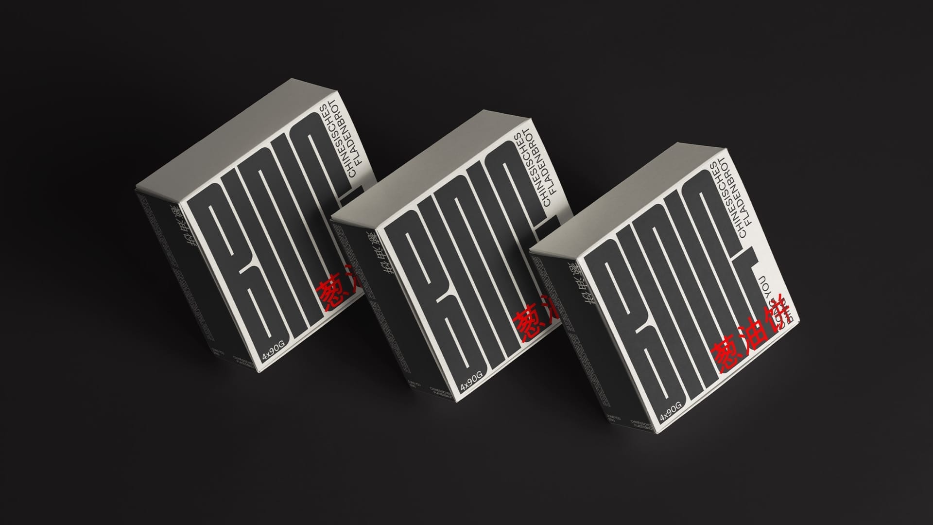
Minuto Bakery
Packaging that makes diversity visible.
Services
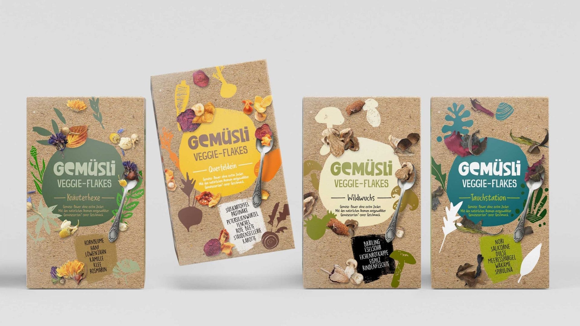
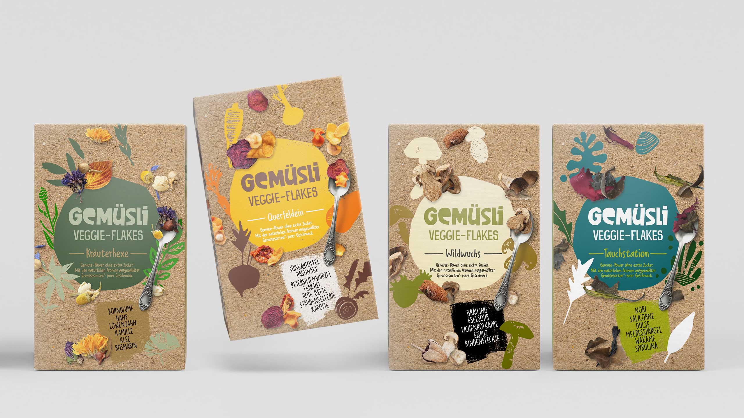
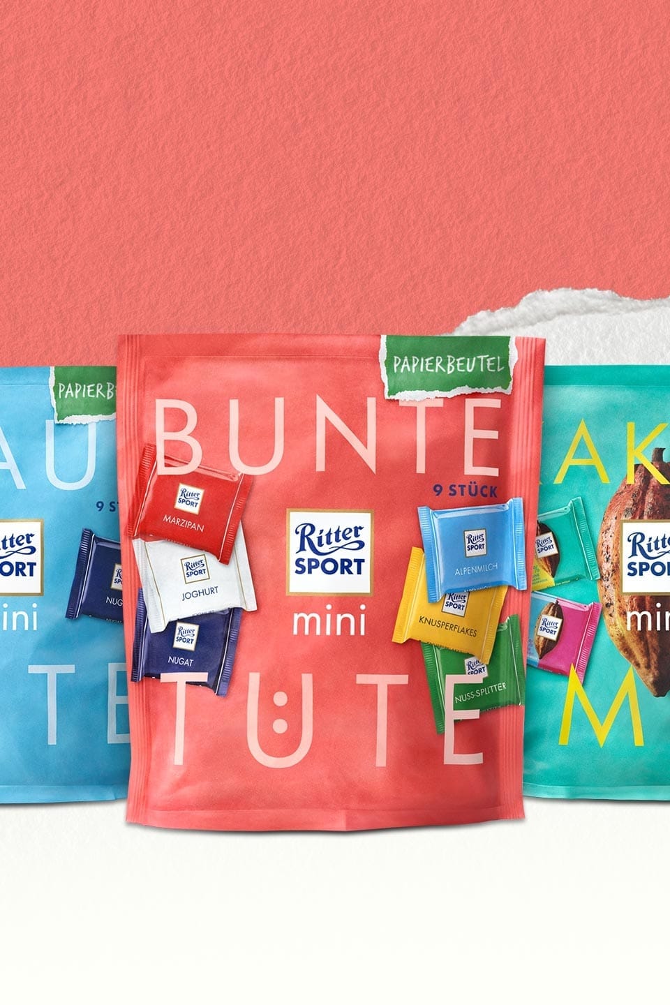
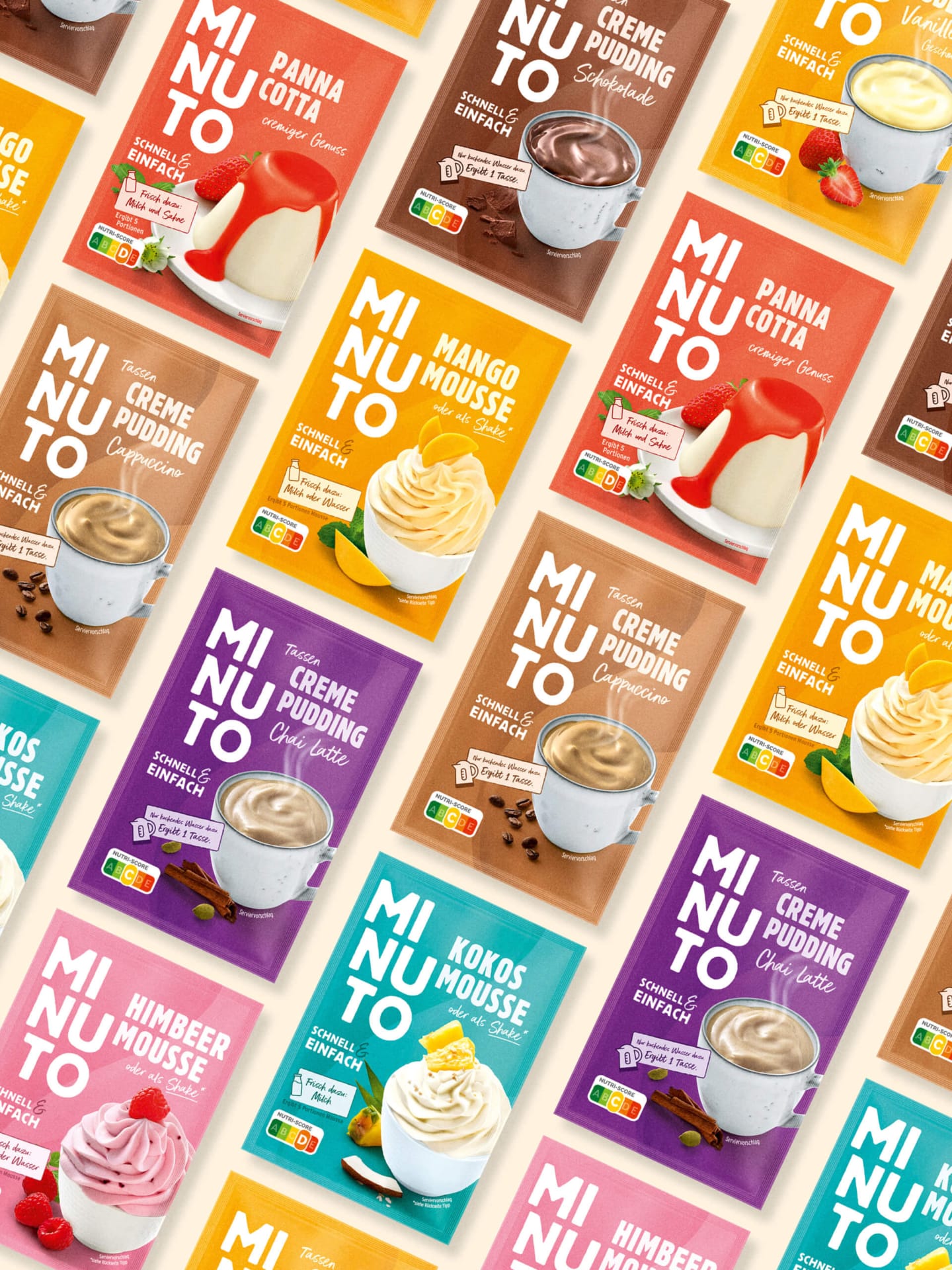
MINUTO proves that uniform brand design and maximum variety are not mutually exclusive – in fact, they reinforce each other. The design system brings order to the shelf and orientation for consumers without sacrificing character.
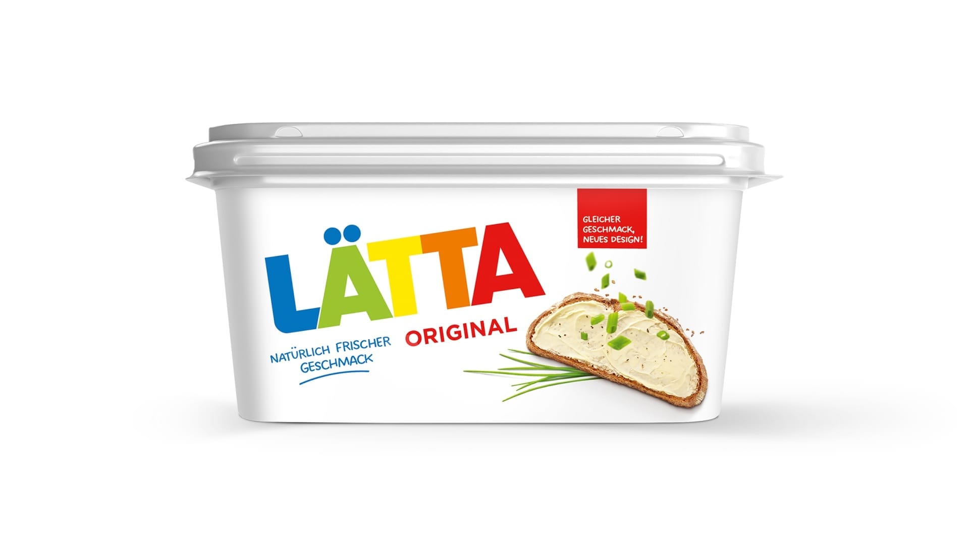
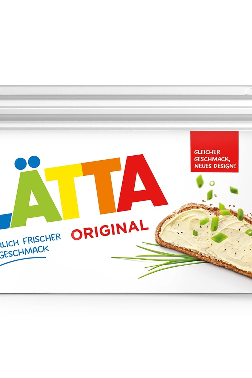
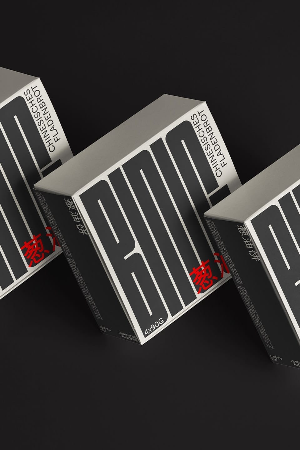
Strong brand through strong typography
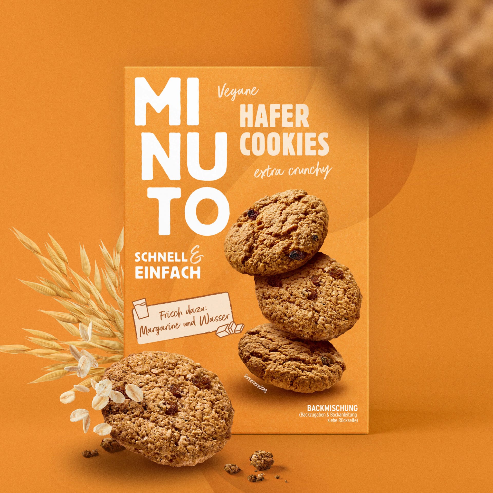
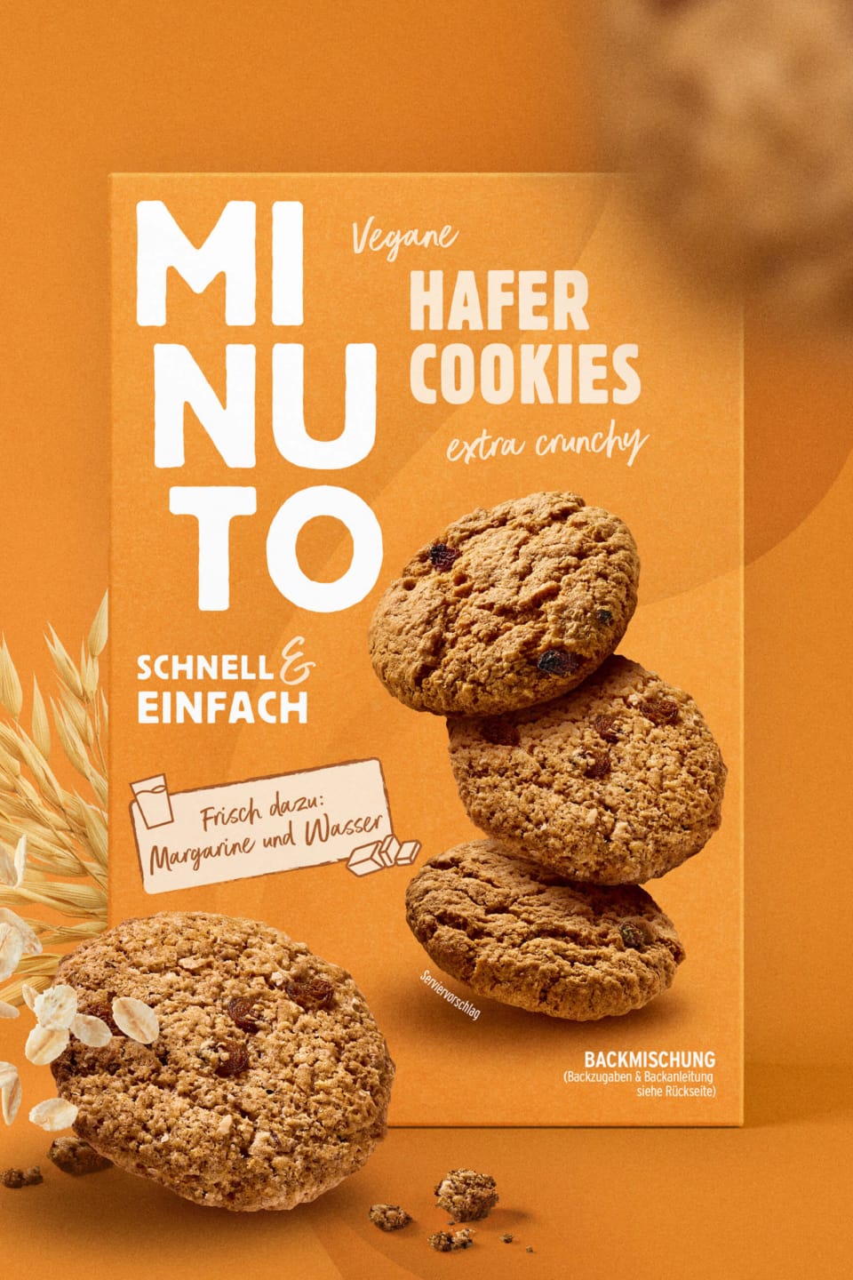
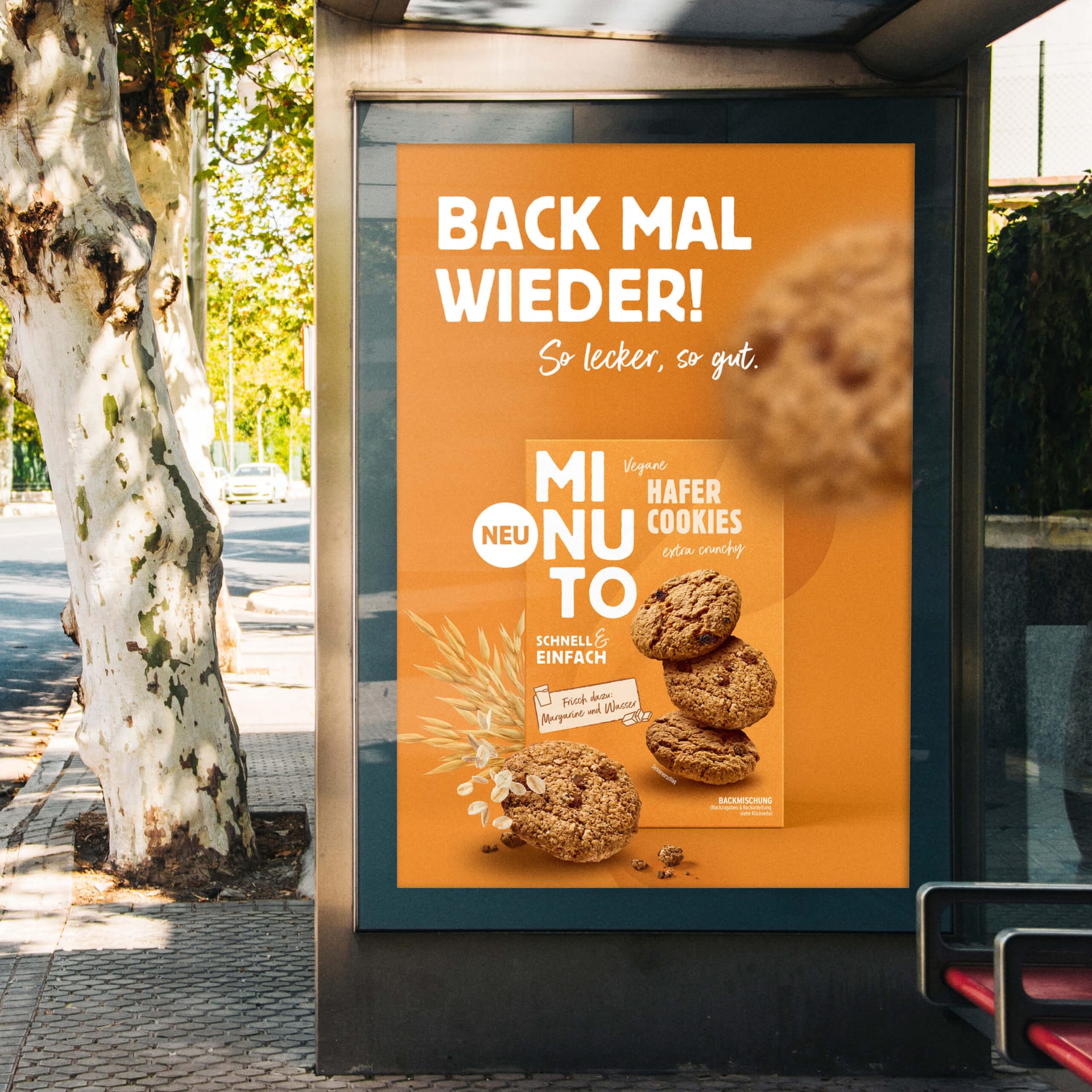
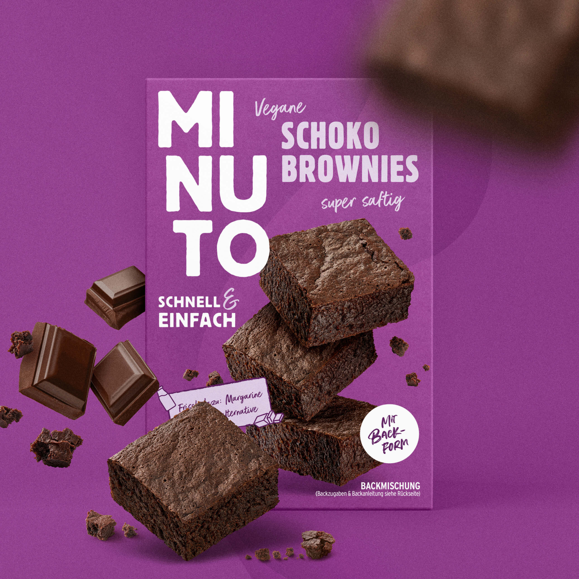
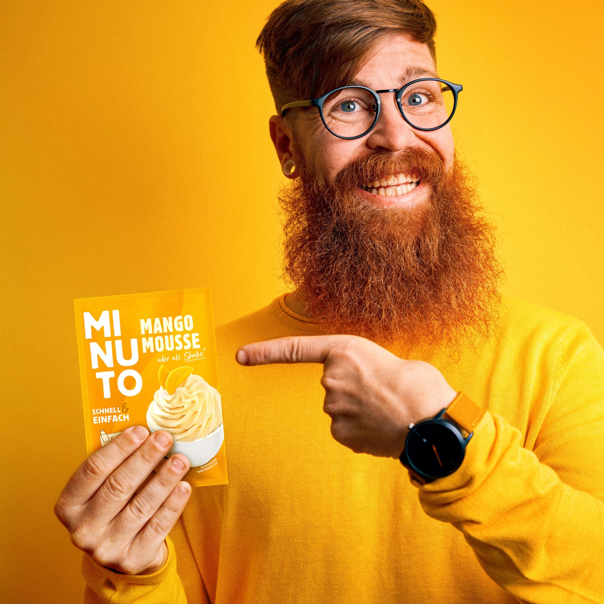
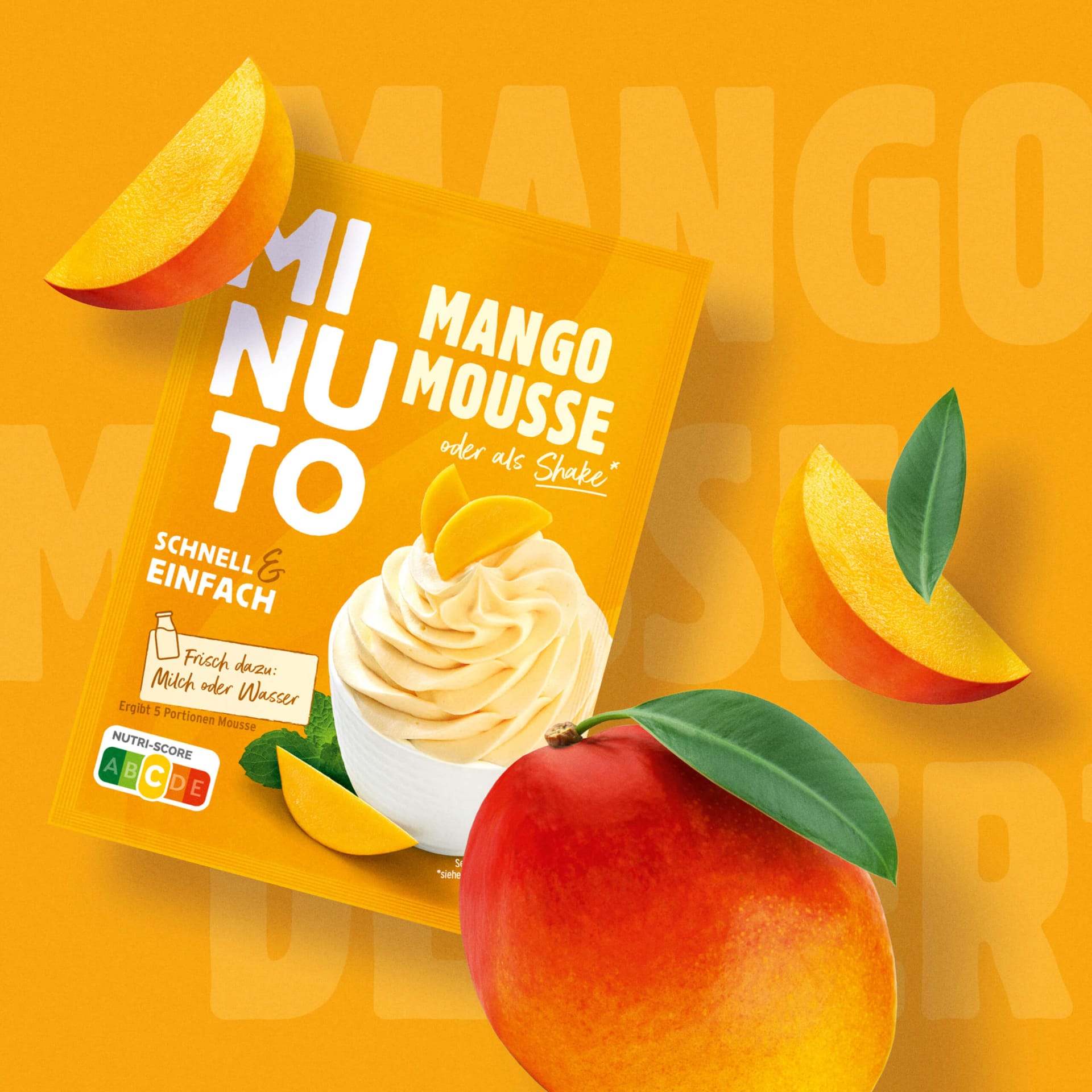
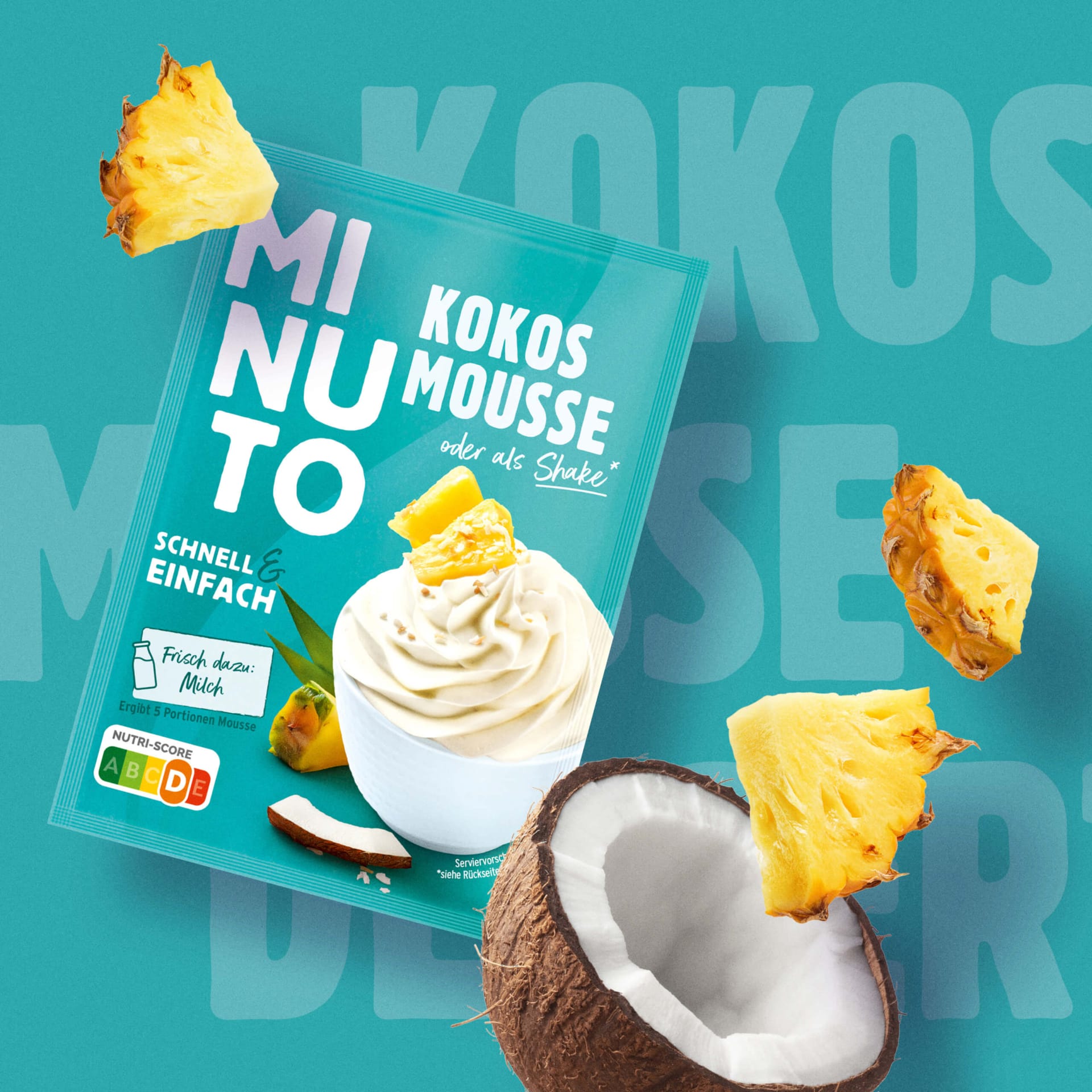
The three-stage block lettering “MINUTO” is the centerpiece of the design. Set in white on a strong background, the typeface looks like a seal of quality. A stairway to success. The large, vertical logo creates a high recognition value and has an immense long-distance effect, making the products stand out clearly from the competition.
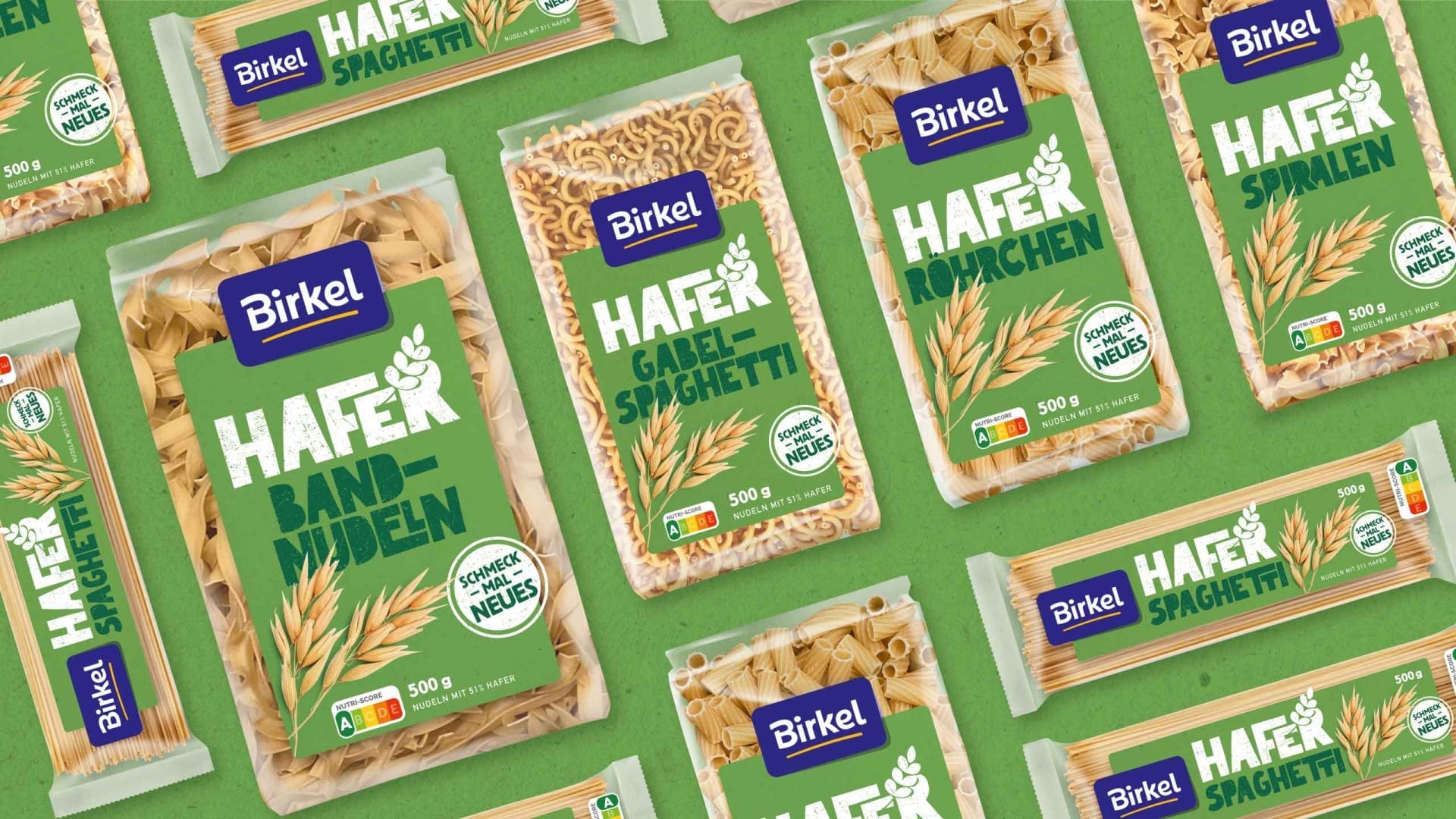
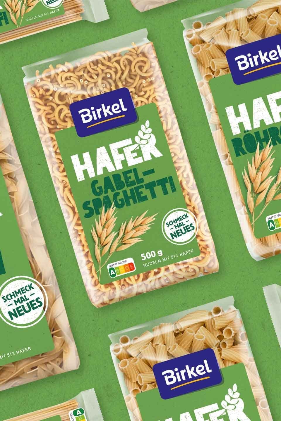
Color coding that works immediately
Each product category has its own world of color – from soft pink for creams to vibrant purple for moist chocolate brownies. The sophisticated color coding facilitates navigation, encourages repeat purchases and makes the different product ranges easy to identify at a glance.
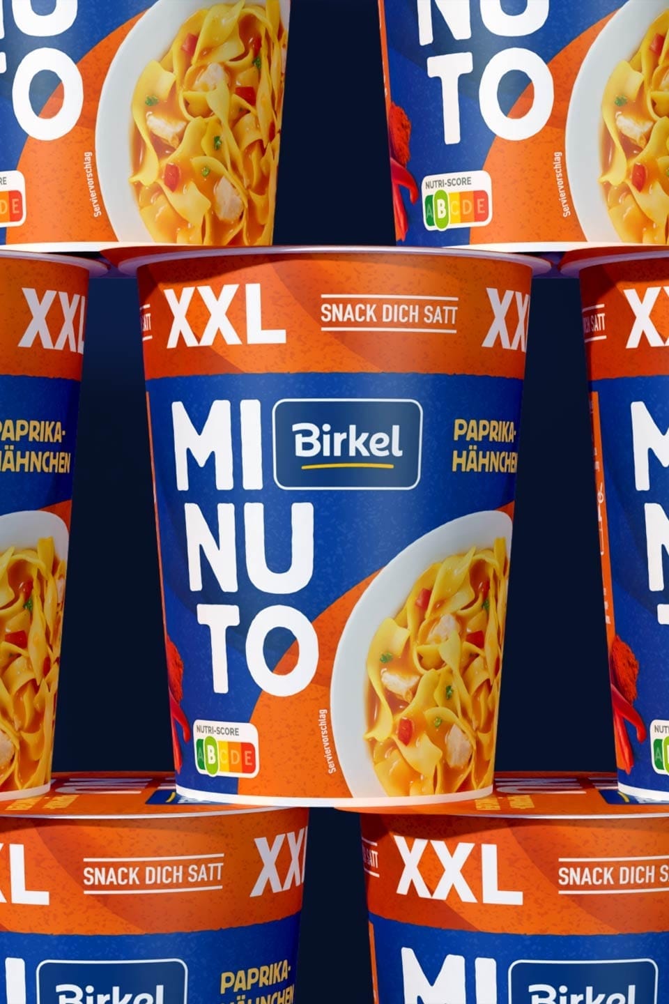
Visual consistency meets emotionality
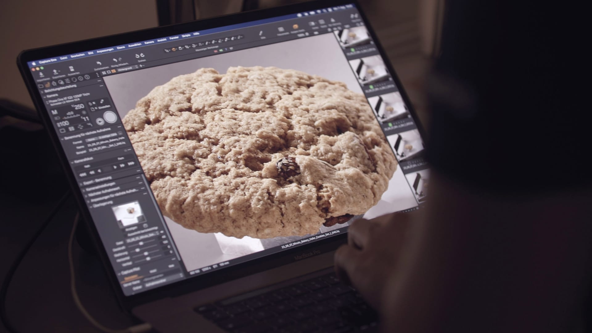
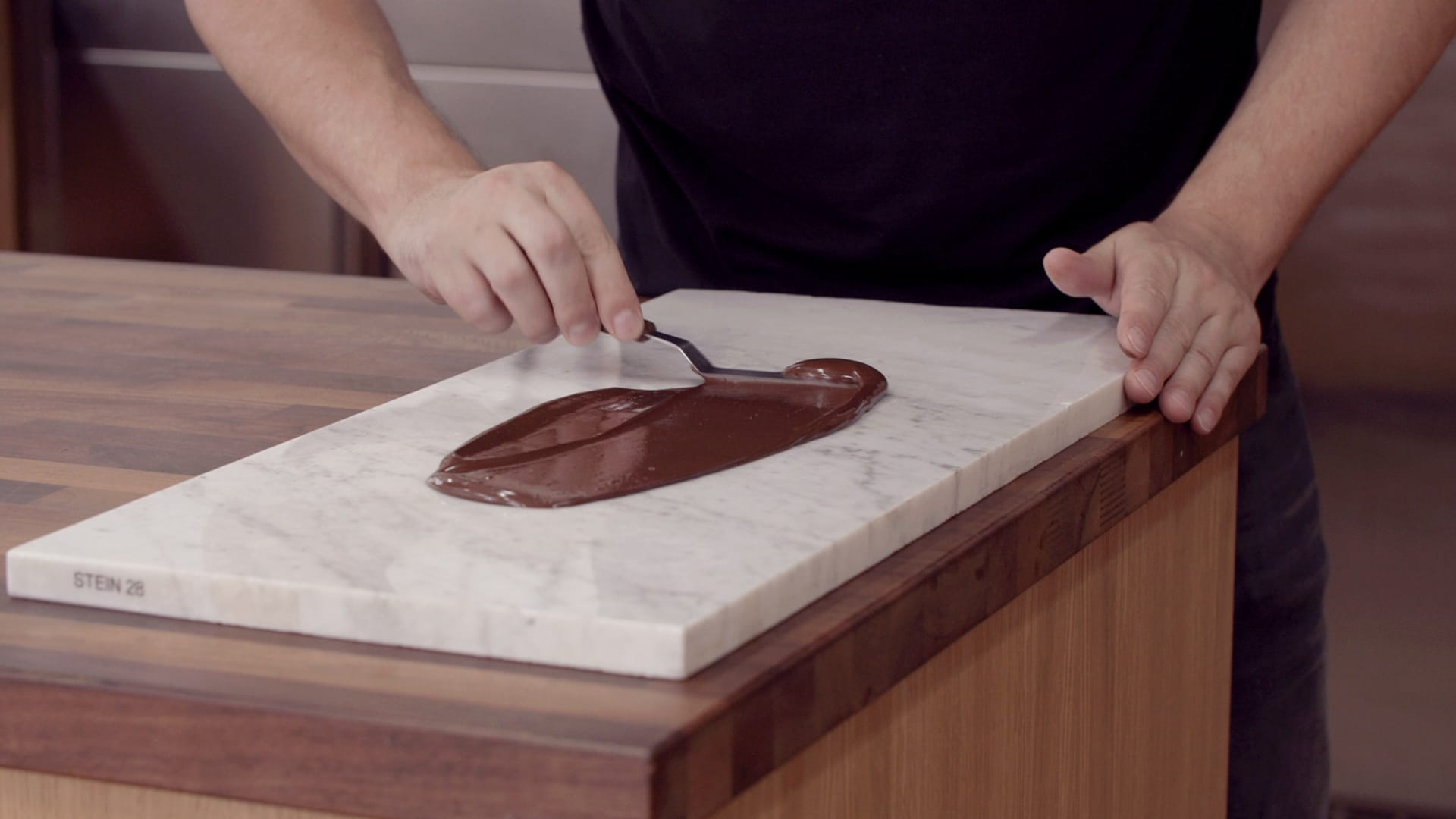
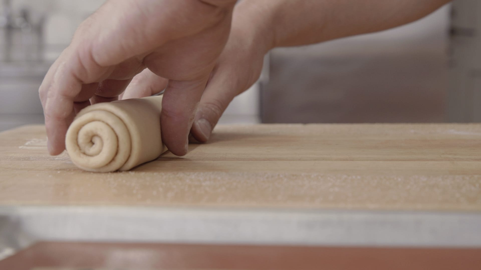
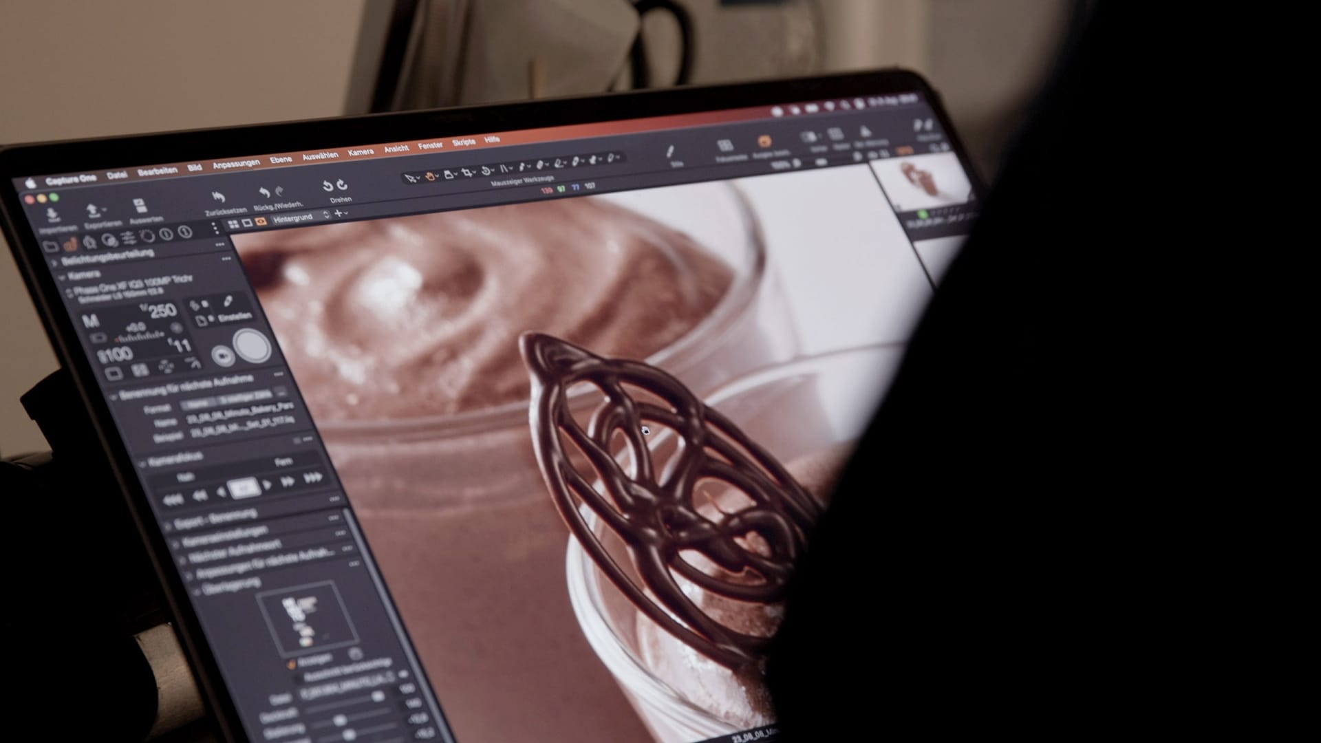
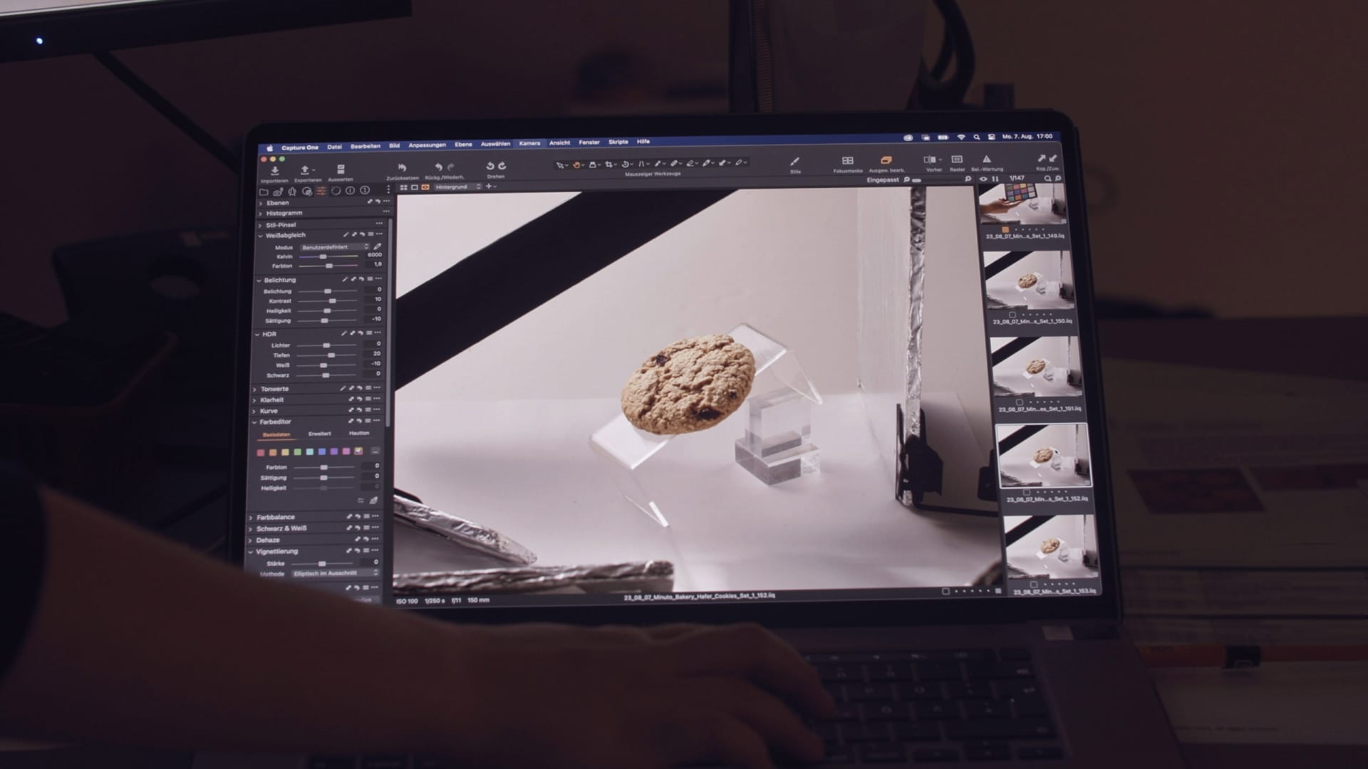
Despite the clear structure, the design remains emotional: product photos with appetizing styling, lovingly placed icons and illustrative elements give each pack personality. The clear appearance suggests reliability – the emotional food styling makes you want more.

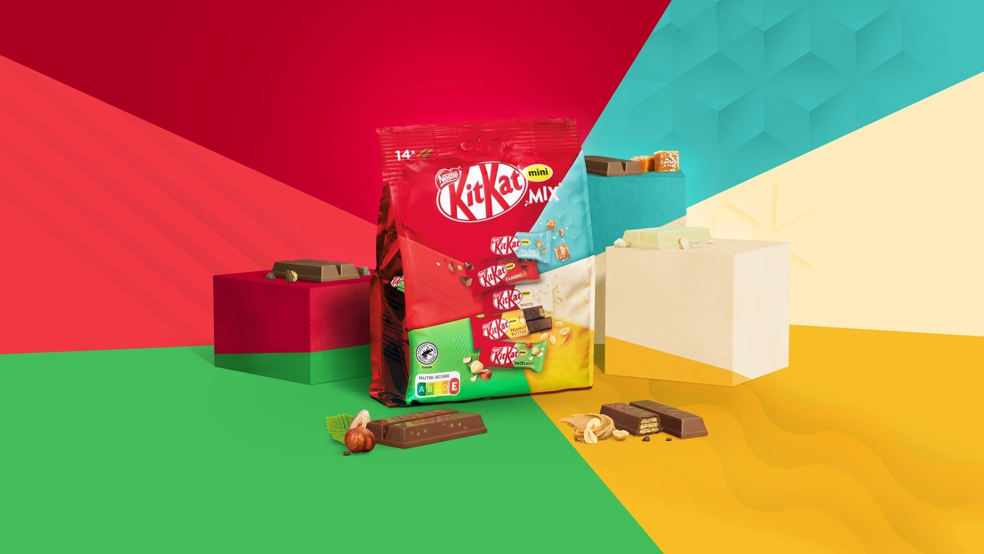
Design that creates trust
The strong brand bracket always remains recognizable. This creates brand loyalty and trust. Consumers know: If it says MINUTO on it, it means uncomplicated enjoyment.

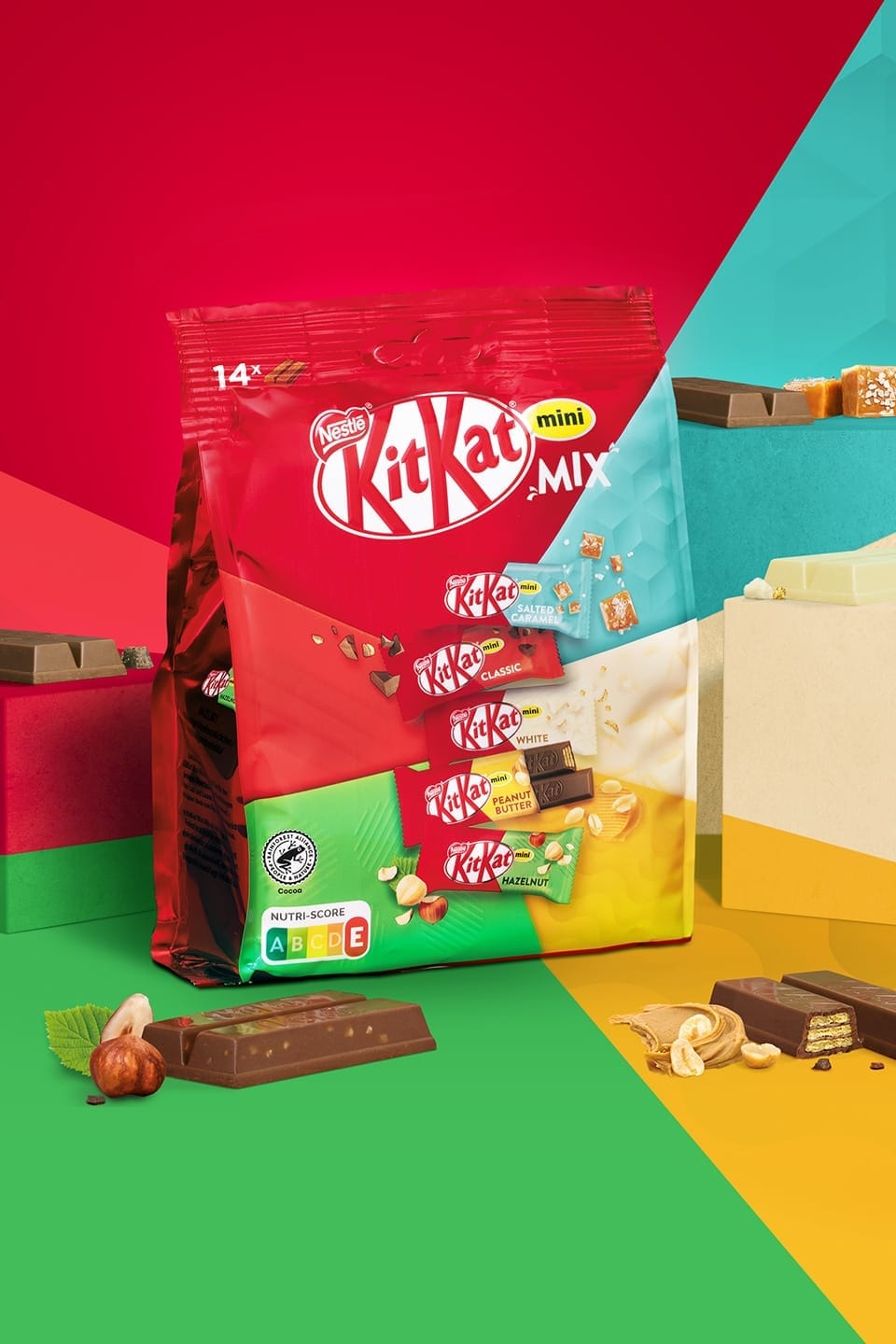
Good packaging is brand management in color and form
As a packaging design agency, we know how to structure product ranges, create recognizability and convey emotionality – as with MINUTO from Birkel.
Would you like to showcase your range just as strongly?
Then let’s create your next design system together with character and consistency.